Route
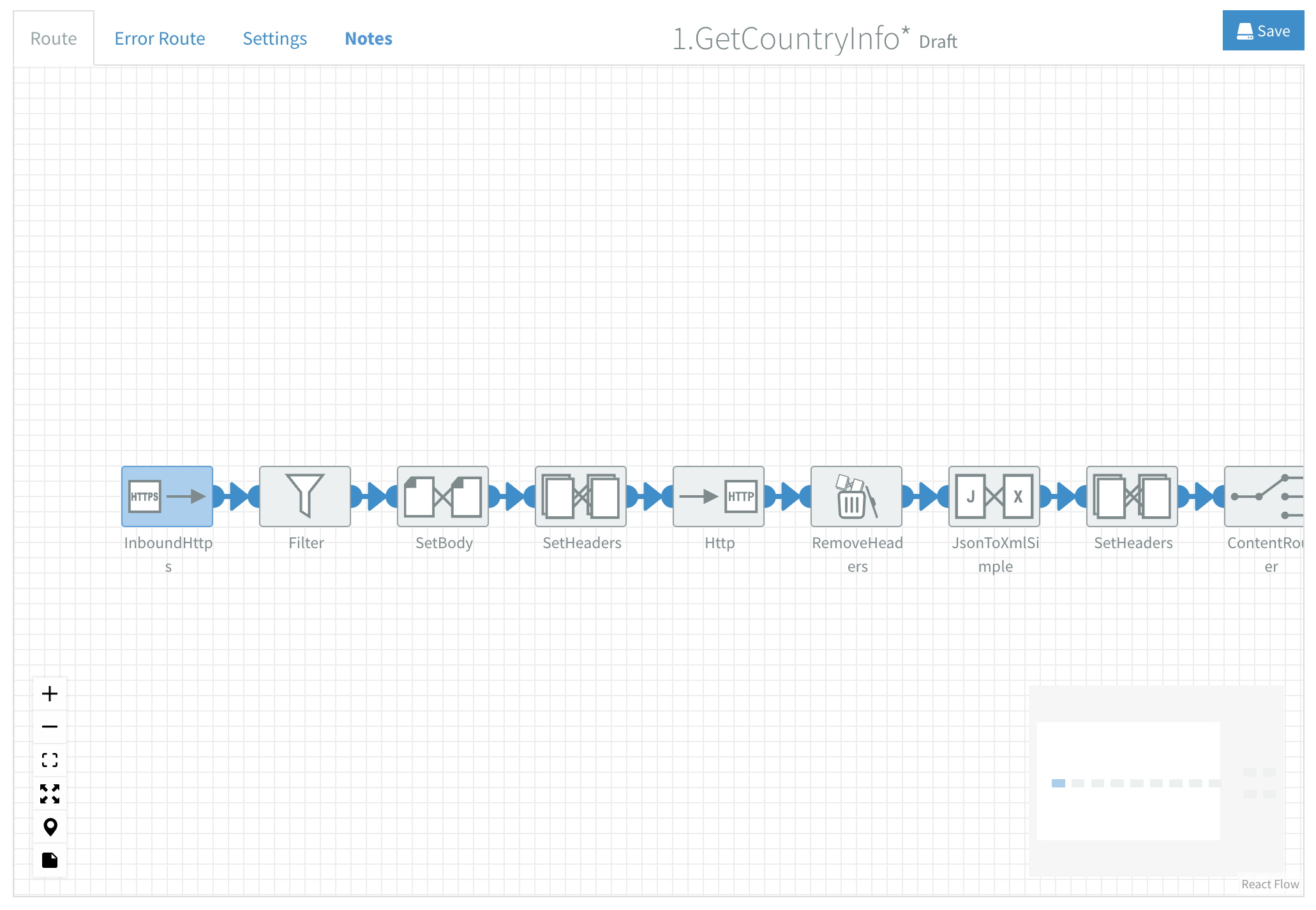
The Route tab contains the most important part of the Flow Designer: the canvas. Each new flow starts with a blank canvas where you design and develop your integration.
The Error Route tab also contains a canvas where you design and develop the error handling for your flows.
The canvas includes a mini map to help you navigate large flows easily. You can adjust mini map settings in User Settings - Preferences.
Designing your flow
To start designing your flow, drag components from the Component Library onto the canvas and connect them. Then, configure the components as needed, resolve all Validations issues if there are any and start the flow from the Versions sidebar when it's ready.
Configuring components
Most components have configuration options that define their functionality, sometimes they are optional or already have default values defined.
To access configuration options:
- Double-click on a component.
- Hover over a component and click on the
icon.
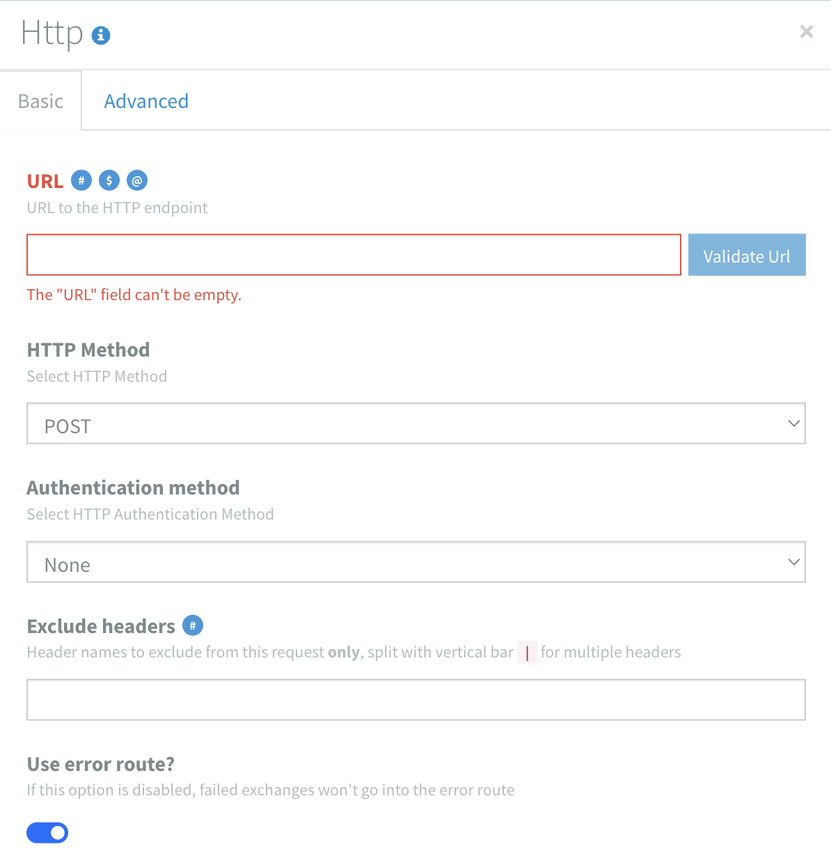
Some components have tabs with Basic and Advanced configuration options.
If an option is invalid, the input field turns red and an error message appears. If the error applies only to the Test or Production environment, this is indicated. Several visual cues highlight validation issues in your flow, read more about that on the Validations page.
- All configuration options include help text for additional guidance.
- Click the
icon behind the component name to go to it's full documentation.
Quick insert of variables
The
Read more about using variables in Dovetail on this reference page.
Connecting components
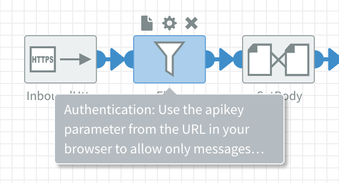
Drag from one connector to another to link components together. Connectors are the blue semi-circles on a component's edge. A line with an arrow will appear, indicating a successful connection and the direction of data flow.
Components are:
- Consumers: They receive data, with a connector on the right side.
- Producers: They send data, with a connector on the left side.
- Consumer and Producer: They receive and send data, with a connector on both sides.
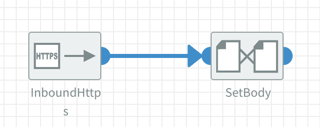
In the example above, when you drag from the right side connector of the Inbound HTTPS component to the left side connector of the SetBody component it allows messages to flow from the output of the Inbound HTTPS component to the input of the SetBody component.
Depending on their characteristics, some components cannot be used as the first or last component in a flow. The related connectors will be ommitted from the component.
Some components:
- Allow multiple lines from a single connector: i.e. the ContentRouter component has an output line for each specified rule.
- Have extra connectors: i.e. the Split component has a bottom edge connector to route splitted messages.
Adding notes to components
Flows can become complex quickly. To document them effectively, you can add notes to components. Hover over a component and click the
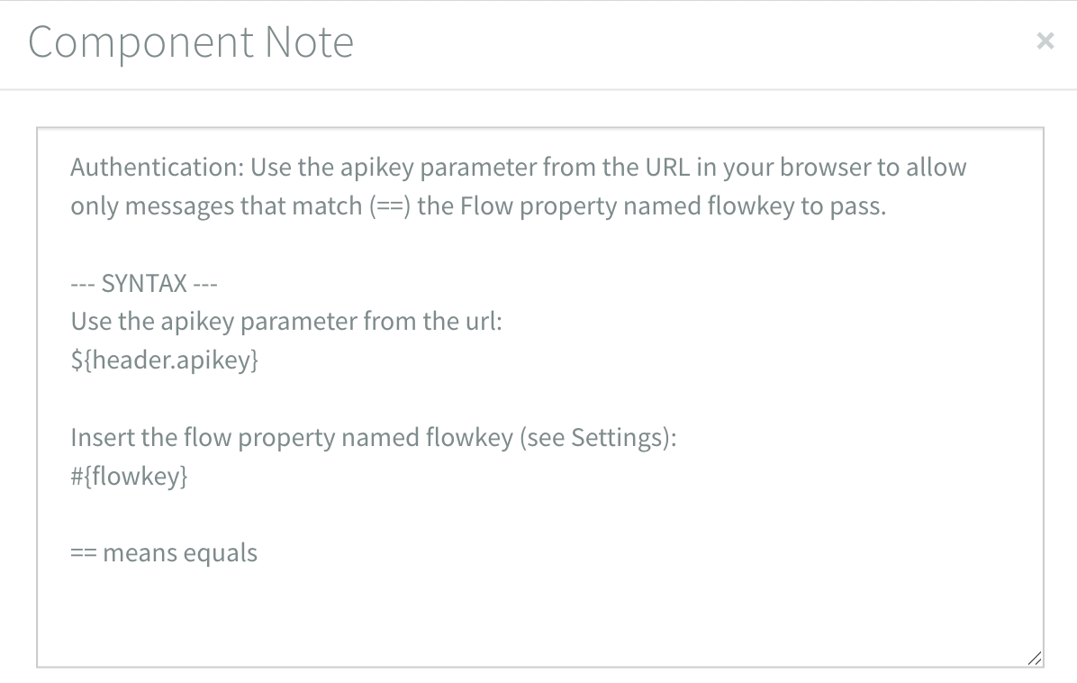
If a component has a note, a preview appears when you hover over it. Click the
Click the
Removing components
Hover over a component and click on the
Using the canvas
The canvas offers multiple mouse actions, menus and keyboard shortcuts to streamline flow development.
Mouse actions
The following actions can be performed using your mouse:
- Pan: Right Click + Drag Mouse
- Scroll vertical: Mouse Scroll
- Scroll horizontal: Shift + Mouse Scroll
- Zoom: Spacebar + Drag Left Mouse
- Open Actions menu: Right Click
- Selecting components:
- Select one: Left Click
- Add/Remove one: Shift + Left Click
- Select multiple: Left Click + Drag Mouse
- Deselect: Left Click Canvas
In the User Settings - Preferences you can override Mouse Scroll to become Zoom instead of Scroll vertical.
Canvas menu
The Canvas menu is located at the bottom left of the canvas.

Use it to:
Zoom in Zoom out Fit flow to screen Fullscreen mode Go to flow start Open/Close all notes
Actions menu
Open the Actions menu with Right-click. Among often used actions, it displays the corresponding keyboard shortcuts.
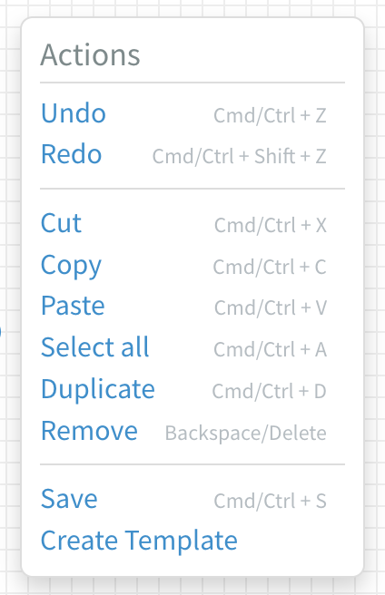
Use it to:
- Undo: Cmd/Ctrl + Z
- Redo: Cmd/Ctrl + Shift + Z
- Cut: Cmd/Ctrl + X
- Copy: Cmd/Ctrl + C
- Paste: Cmd/Ctrl + V
- Select all: Cmd/Ctrl + A
- Duplicate: Cmd/Ctrl + D
- Remove: Backspace/Delete
- Save: Cmd/Ctrl + S
- Create Template