Flow Validation
Every time you make a change to your flow, Dovetail checks if it would be able to install a flow to a specific environment. A flow is 'valid' when each component has been correctly setup; the flow can process any transactions through each of it's components, from start to endpoint.
To help you with designing a flow there are some visual tools available:
- Quick overview per environment
- Invalid components become red
- Validations tab
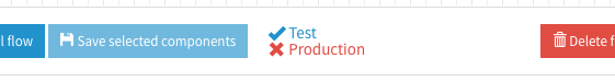
Quick overvier per environment
A blue check mark is shown next to the environment name, to display if the flow is valid for that environment. When a flow is invalid for an environment, a red 'x' is shown next to the environments name.
If a flow in invalid for all environments, the install button is disabled.
Invalid components
If the settings of the component don't meet the minimal requirements or contain errors, then the component becomes red.

Validations sidebar
The sidebar shows all the validations of the current flow. When you click on one of the cards it will be expanded and shows the messages which will explain what is wrong. Most of the messages will be from the component validations and will have the name of the component as their title. The messages that are shown depend on which route you are currently situated for example: validation messages for the error route are only displayed when you have the corresponding tab opened. There are three types of messages: error, warning and info.
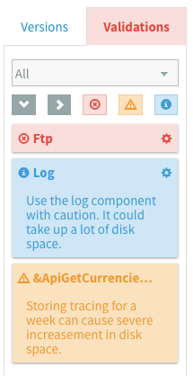
Error messages
Error messages contain the descriptions of problems that need to be solved before a flow can be installed. These are in sync with the validation errors of the components.
Warning messages
Warning messages can contain guidelines which could help you with preventing common design mistakes or provide information on deprecated components. These won't prevent you from installing flows, but they should be taken in consideration when designing flows.
Info messages
Info messages can contain useful tips and tricks or more general information.
Message Behaviour
When hovering over a validation message in the sidebar, the corresponding component on the canvas will start to glow. This helps you determine for which component it applies. If you want to change the properties of the component you can click on the cog wheel next to the name of the component to open the properties view. The properties view can also be opened by clicking on one of the descriptions.
Filtering messages
All the validation messages can be filtered by environment and by the type of the messages.
Filter by environment
The dropdown list contains all the available environments and a default All option. This is mainly
to filter the messages which belong to components.
Filter by type
The messages can also be filtered on type by clicking on one or more of the corresponding buttons. The active button filters get a "pressed down" effect.