Flow Validation
Every time you make a change to your flow, that flows is validated for every environment (test or production). A flow is considered valid when each component is configured correctly and it can successfully process transactions through all its components, from start to finish.

Visual indicators
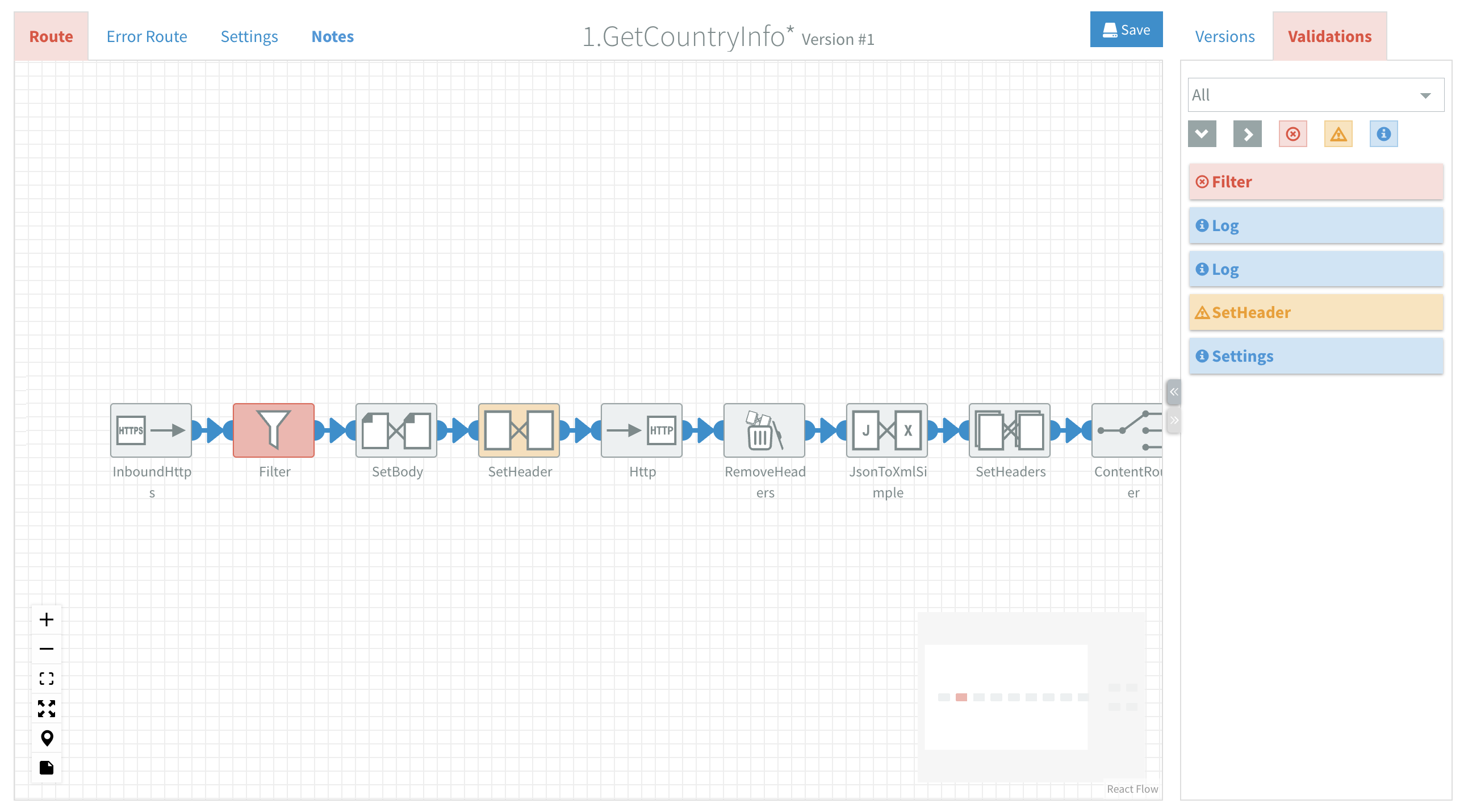
To assist you in designing a flow several visual indicators are provided. When an error occurs in the design of your flow:
- The Route/Error Route and Validations tabs turn red.
- Invalid components turn red.
- Validations sidebar displays detailed information about the issue(s).
Validations sidebar
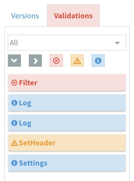
The Validations Sidebar lists all validation messages for the current flow. Click on an entry to expand it and see detailed error messages explaining what needs to be fixed.
Most messages originate from component validations and include the component's name as the title. The displayed messages depend on the active tab—for example, validation messages for the Error Route are only shown when the corresponding tab is open.

There are three types of validation messages:
Error messages
Error messages describe critical issues that must be resolved before the flow can be installed. These messages align with component validation errors.
Warning messages
Warning messages provide guidance on avoiding common design mistakes or notify you about deprecated components. Warnings do not prevent you from installing a flow, but they should be considered during flow development.
Info messages
Info messages contain useful tips, best practices or general information.
Message Behavior
When you hover over a validation message in the sidebar, the corresponding component on the canvas will glow. This helps you identify the affected component. Click on a validation message to navigate directly to the erroneous property.
Filtering Messages
Validation messages can be filtered by environment and message type.
Filter by Environment
A dropdown list allows you to filter messages based on the environment. The default option is All, which displays messages for all environments.
Filter by Type
Enable or disable the corresponding buttons to filter messages by type (Error, Warning or Info).